Interior Kitchen - Ad Case Study
The Problem
This German kitchen company was running an ad to sell high-end kitchens with a free Quooker (a premium tap worth $1,500). However, they were facing issues with low conversion rates because of a disconnect between the ad and the form.
The ad promised a free Quooker, but once people clicked on it, they were taken to a form offering a 20% discount instead. This confusion likely caused many potential customers to drop off, losing interest before completing the form.
Our Approach
We realized that having two offers – one in the ad (free Quooker) and another in the form (20% off) – was confusing for customers. It created hesitation and doubt, making the customer wonder, "Which is it?"
We decided to simplify the offer and make the process more straightforward.
1. The Offer
Old Version: (Translated from German)
"Spring Promotion: Free Quooker!
Welcome spring with a new kitchen and a free Quooker. Let design and functionality blossom in your home.
➡️Your free Quooker is waiting – fill out the form now to secure the Quooker!"
The Form:
"Get a 20% discount on your new kitchen now. Our team of experts will contact you immediately once the form is completed."
What's Wrong? The ad was promoting a free Quooker, while the form offered a 20% discount. This confused the potential customer and likely caused many to abandon the process.
New Version of The Offer Line:
"Get 20% Off Your New Kitchen – Fill Out the Form Below, and We'll Help You Design the Perfect Kitchen for Your Home!"
Or, if they wanted to stick with the free Quooker offer:
"Get A Quooker (Valued at $1,500) For Free With Your New Kitchen – For The Next 16 Clients Only!"
2. The Copy
Old Version:
"Spring Promotion: Free Quooker!
Welcome spring with a new kitchen and a free Quooker. Let design and functionality blossom in your home."
What's Wrong? This headline doesn’t really grab attention. It uses generic language like "Let design and functionality blossom in your home," which doesn’t create any excitement or urgency.
New Version: (We rephrased the copy to be clear)
"Get 20% Off Your New Kitchen.
Let us help you pick the best kitchen for your home.
Fill out the form below to get your discount and we will get back to you with a custom design!"
If they wanted to stick with the Quooker:
"Get A Quooker (Valued at $1,500) For Free With Your New Kitchen – (For The Next 16 Clients Only!)"
3. The Creative
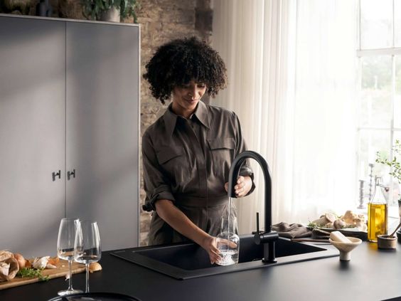
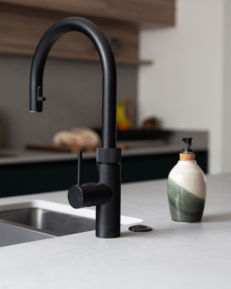
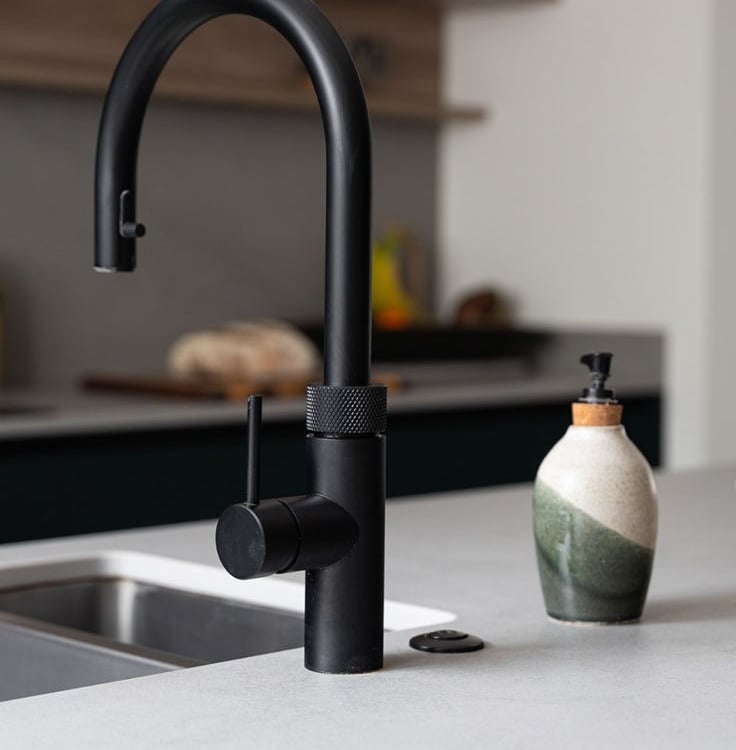
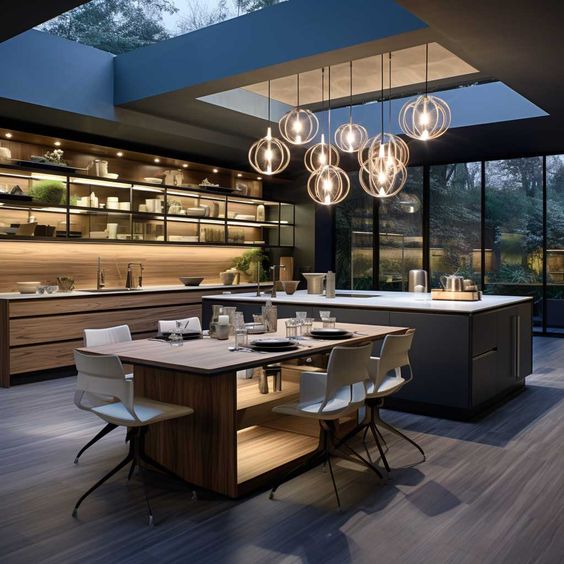
Old Version: The ad featured only one picture of a modern kitchen with yellow lighting and a Quooker tap in the corner.
What's Wrong? Using only one image limited the appeal of the ad. Kitchens are highly personal, and people have different tastes, so it’s better to show a variety.
New Version:
We suggested using multiple images to showcase different kitchen designs and appeal to various preferences.
Conclusion
Based on industry insights, making these changes would likely improve the campaign’s conversion rate by reducing confusion and aligning the messaging from ad to form.
When businesses simplify their offer and make the value clear, lead conversions can improve by up to 20-30%.
Contact us today for a free review of your ads and personalized suggestions to boost your results!
khaledelmongy@mongymarketing.com
Follow For Marketing Tips
Connect with Us
+201055787692